Many of our clients have been asking about the SupplHi brand.
The name SupplHi is an obvious reference to the supply of equipment and services. “Hi” stands for an introduction as well as for the high performance that is required by equipment and service providers to operate in the industrial world.
In designing the brand identity of SupplHi we wanted to reflect our three core values:
- Passion for bringing continuous innovation to the industrial world and to its people
- Integrity in every aspect of our operations and in our people’s behaviour
- Competence focused on the industrial world, to deliver the highest quality in the smallest detail
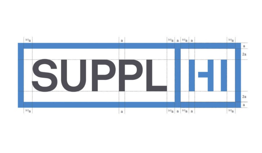
The logo was conceived as a versatile tool to communicate the flexibility of the service, and to serve as an element that can be integrated in the various aspects of the website primarily, and of the print assets secondarily:
- the Box conveys competence and integrity, two of SupplHi’s core values. It also represents the Categories of the Standard Categorization that is the universal language at the heart of the platform. The fact that one box is a square while the other is a rectangle stands for strong roots but also for flexibility: the square will never change, while the rectangle will adapt according to the context in which it will be used. This allows the logo to become way more powerful.
- the de-constructed “Hi”: with just a little tweak to the letter h, the logo builds its own unique personality. The h’s shape reminds of a stencil, conveying the ideas of methodology, geometry, repetition, but also of creativity and passion, a core value at SupplHi. The combination of excitement and experimentation with geometry and repetition makes the logo unique in its synthesis of these elements.
In terms of colours: blue and grey allow the logo to be friendly but very reliable. Reliability and stability are the main values communicated by the colours. Yellow is used as an accent colour, mainly for the Call-To-Actions on the platform.